Overview
I redesigned The Get Up Vintage's responsive website, a boutique specializing in the curation, cleaning, and restoration of elevated vintage pieces. The original site lacked visual storytelling, clear product categorization and opportunities for discovery, resulting in a disjointed browsing experience, particularly for new visitors.
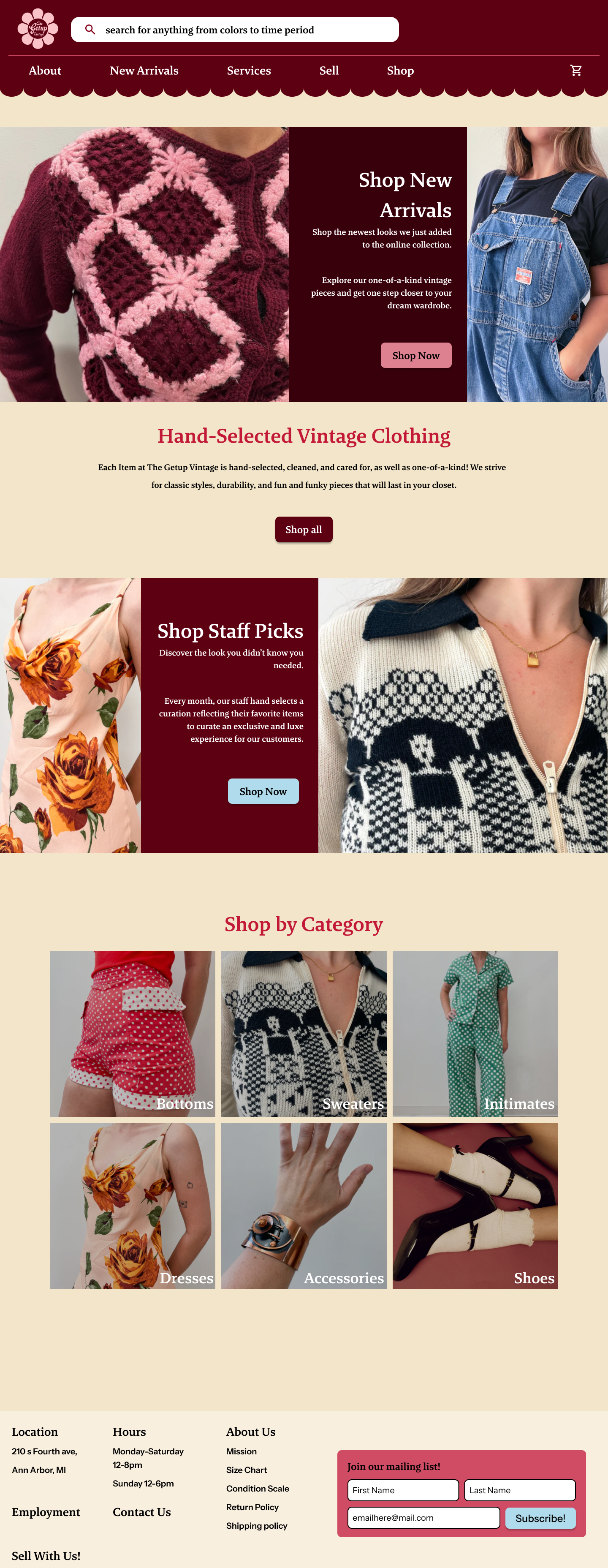
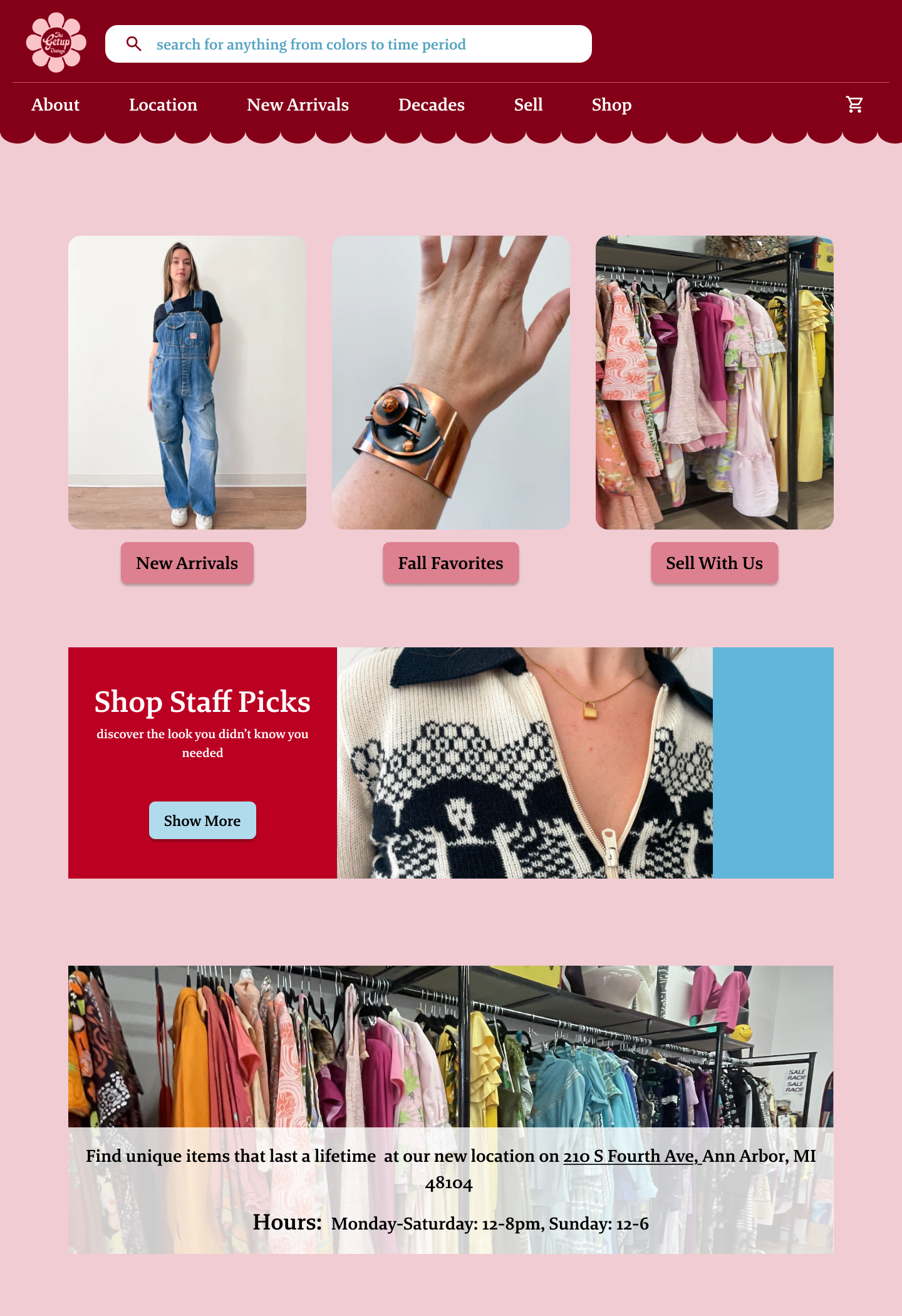
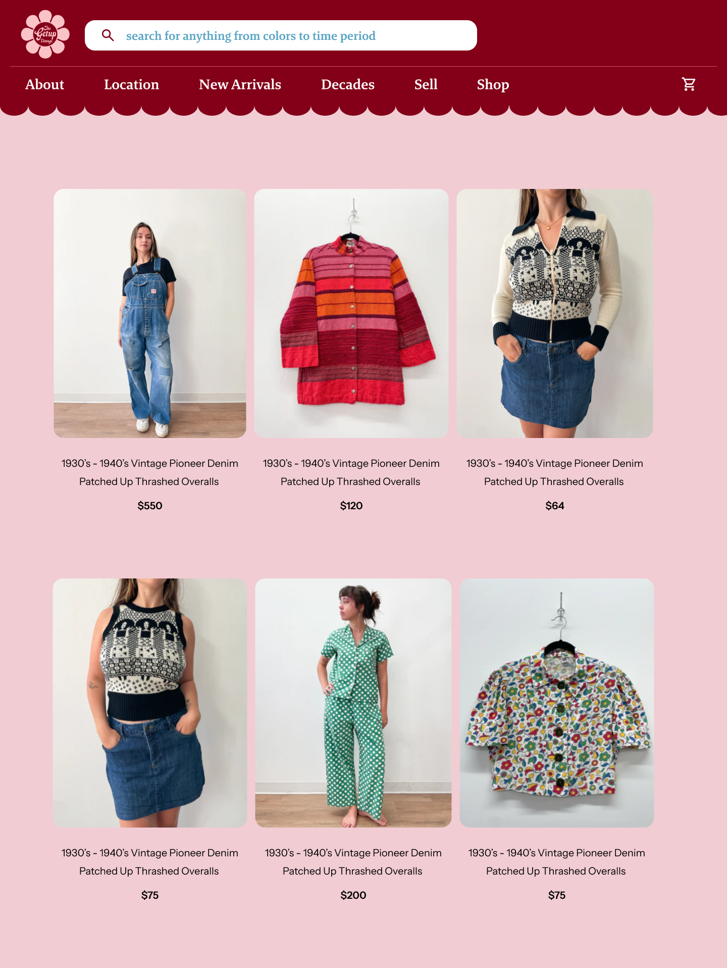
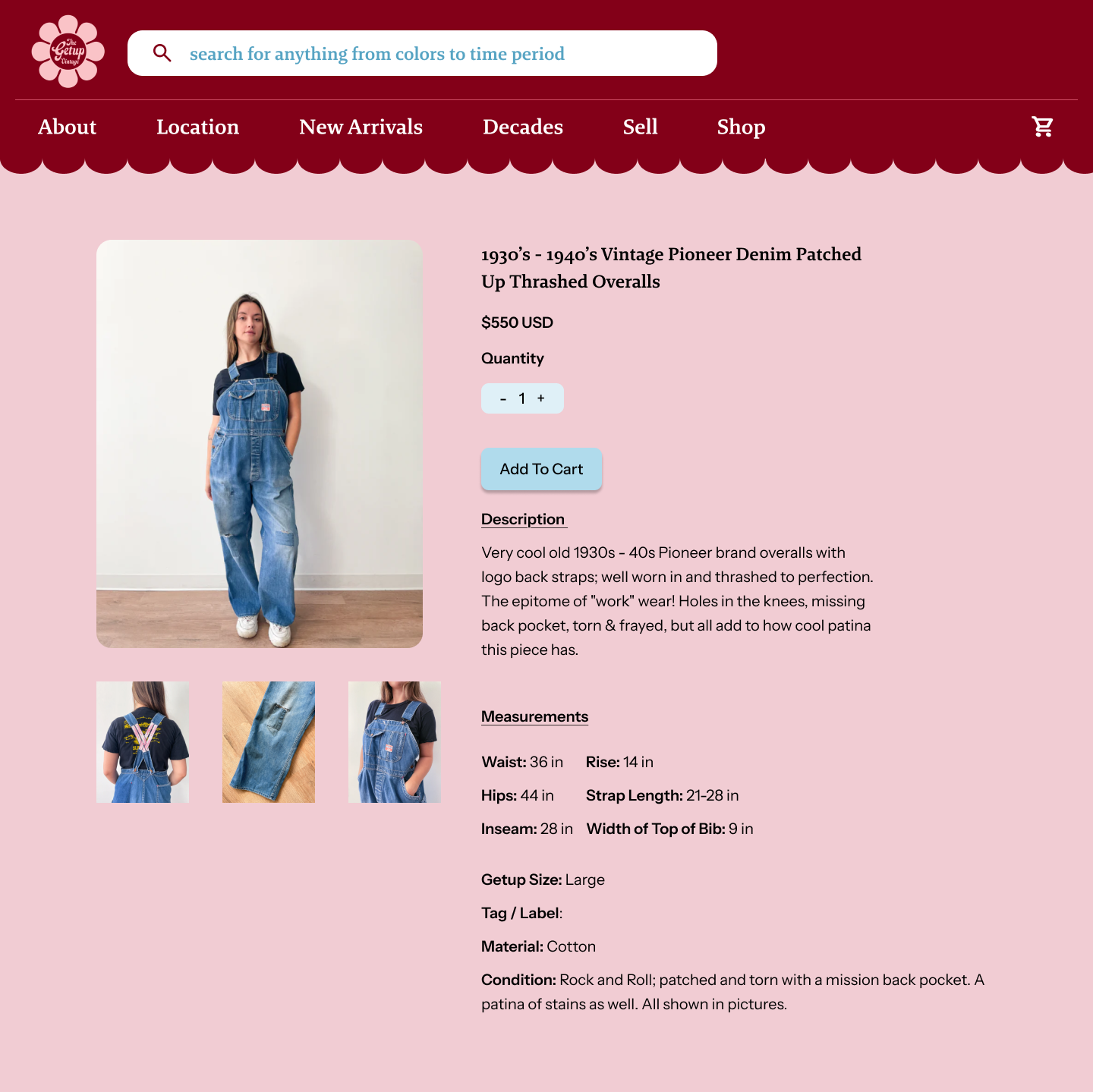
My redesign introduces a landing page that reflects the warmth and personality of the store while clearly communicating its ethos and services. I restructured the information hierarchy and refined category organization to make exploration intuitive and engaging. Updates to the color palette and typography enhance readability and create a cohesive, playful visual flow that mirrors the in-store experience.
Additionally, I simplified the navigation system, reduced visual clutter, and added a search bar for improved accessibility. The new design promotes seamless discovery, enabling users to browse, sell, and learn about services through a chic, colorful interface that embodies The Get Up’s specific identity.
Role:
Solo UX Designer
Design Challenge:
Redesign a local business' responsive website and create an e-commerce flow to create a more engaging and streamlined experience.
Timeline:
September - October 2025
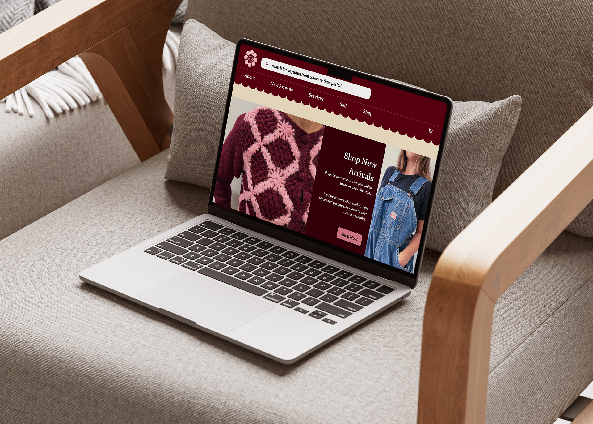
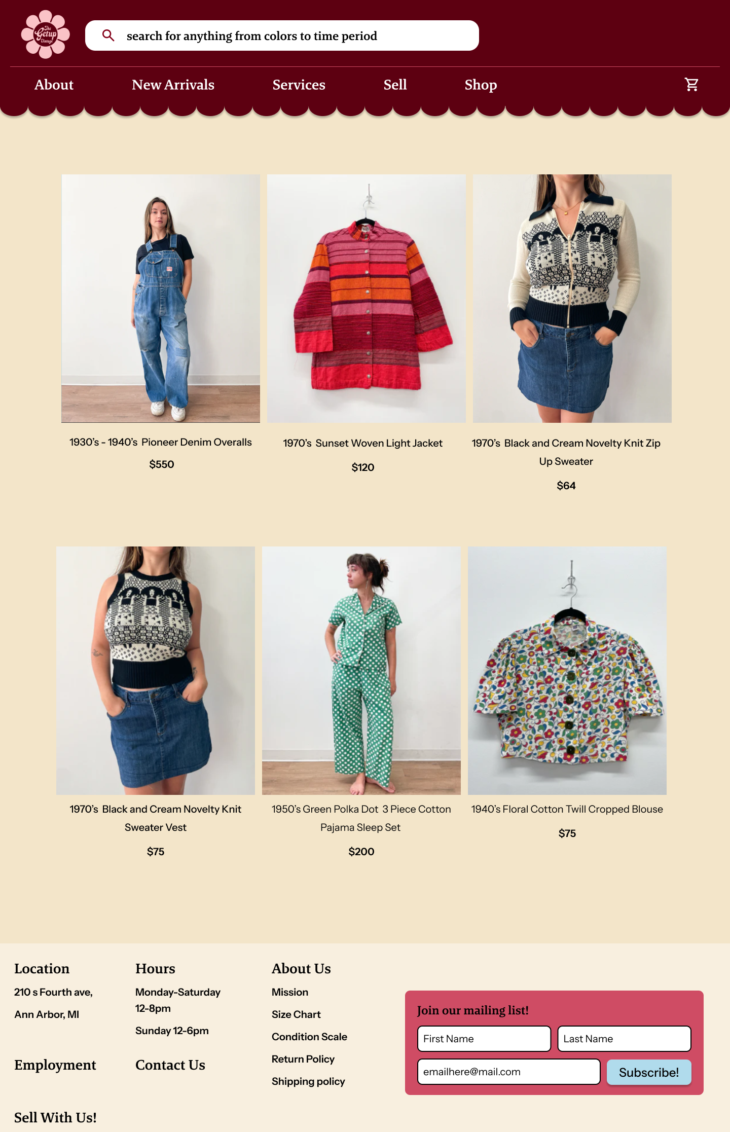
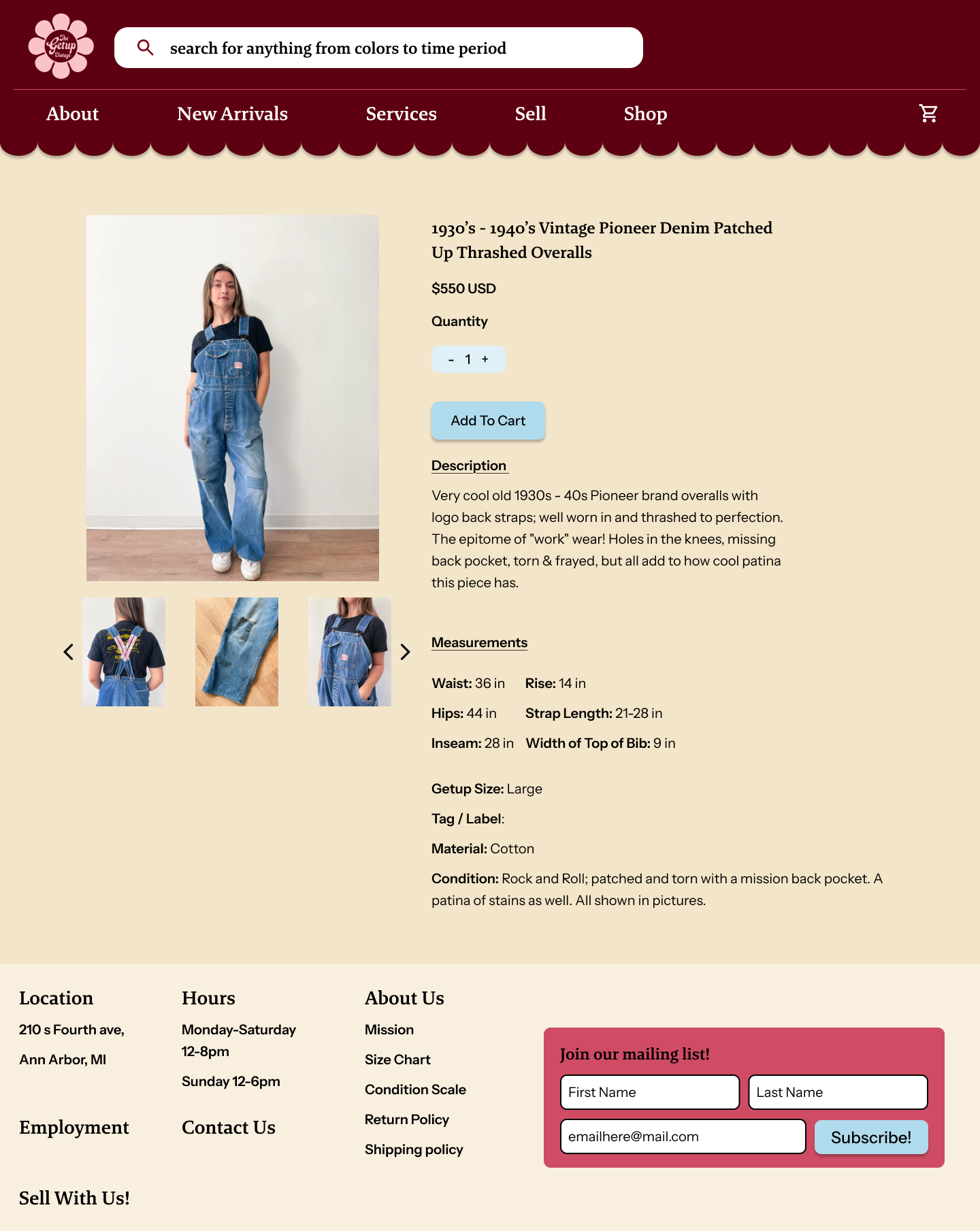
Final Desktop Screens
Breaking down the Process


Understanding and Defining
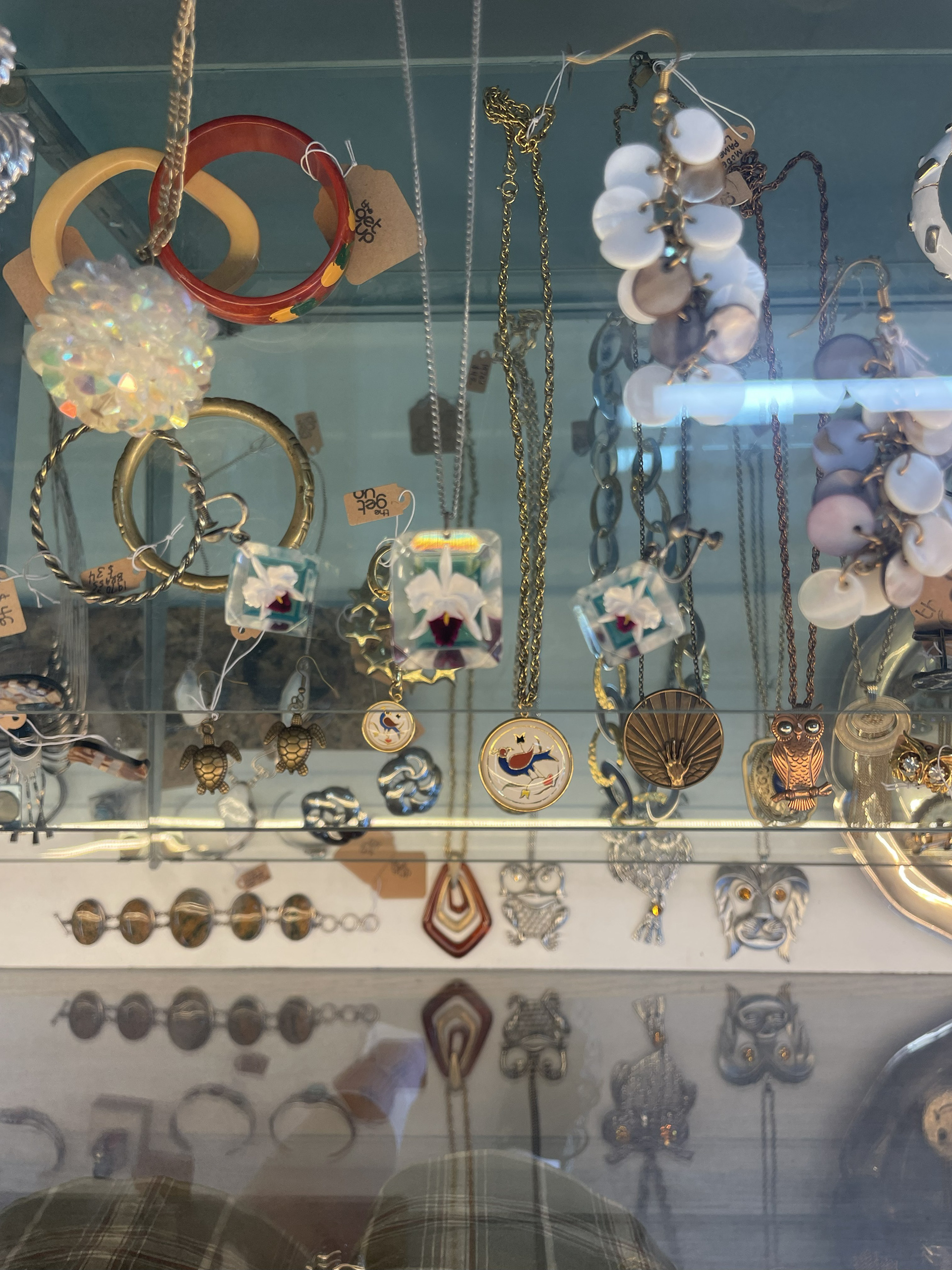
Observations at the storefront:
Context:
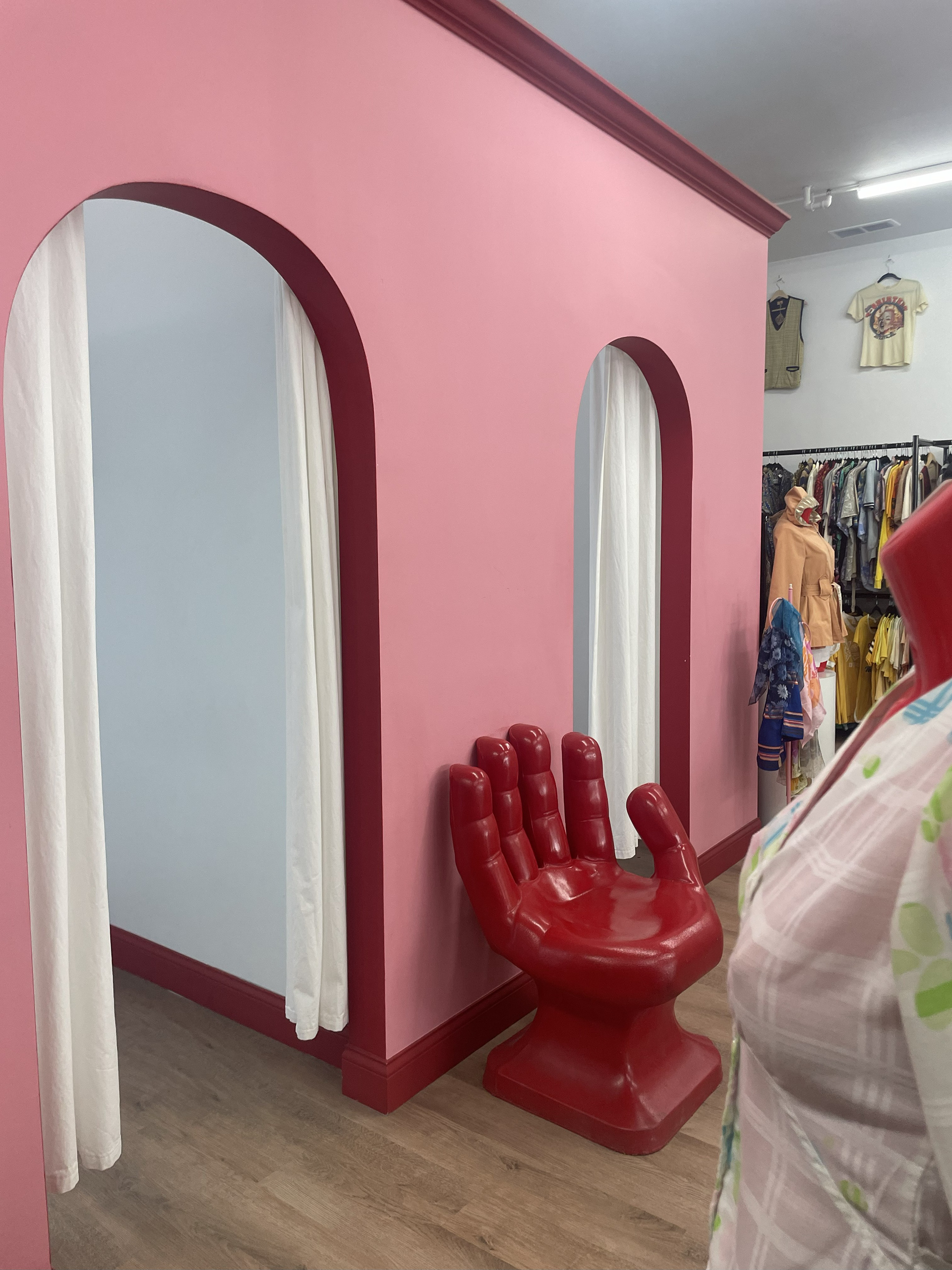
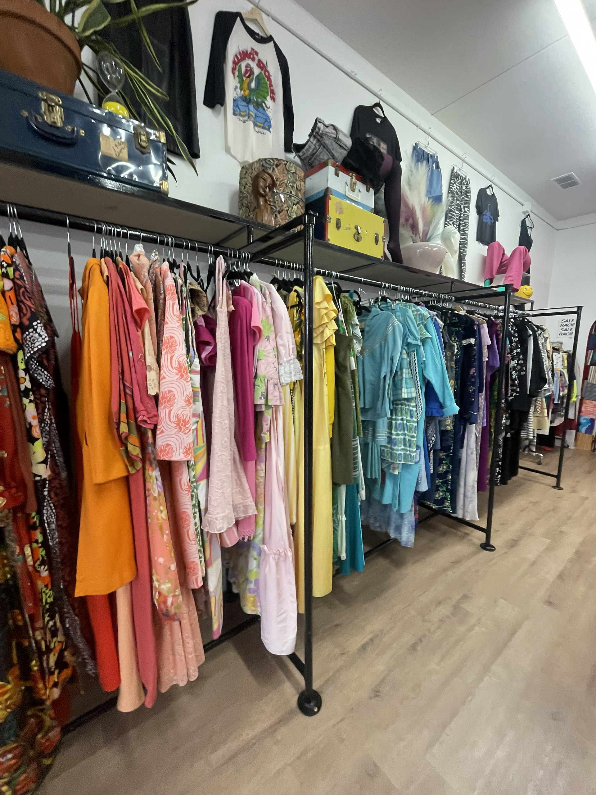
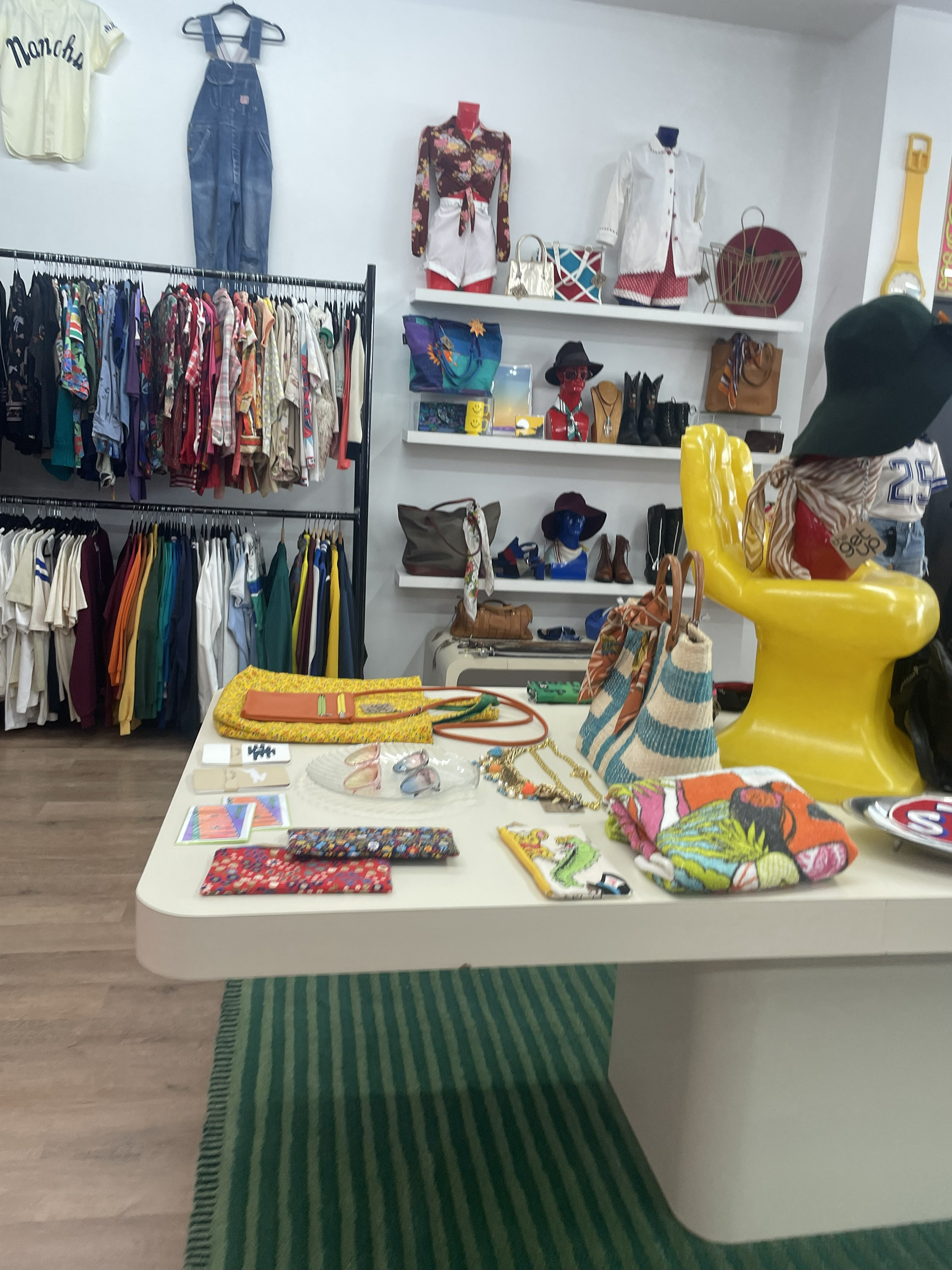
The Get Up is a local vintage and secondhand clothing store known for its bold personality. The space bursts with color, patterned rugs, hand-shaped chairs, stacked suitcases, and old TVs set the tone before you even start browsing the racks. Clothes are organized by garment type and color, making the experience feel like a highly a curated collection rather than your typical thrift store.
The two owners recently moved the shop to a new location as a financial decision. The new space allowed them to combine their cleaning, repair, and sales operations under one roof, cutting rent and transport costs. Interestingly, this new spot sits right across from a high-end hotel, bringing in a wave of new customers: stylish locals, curious tourists, and even the occasional B-list celebrity.
Who Shops Here:
From conversations and observations, three main customer groups stood out:
1) Students - Value-driven shoppers looking for affordable statement pieces
2) Middle-aged locals - shoppers with a defined style who appreciate the store's one of a kind pieces
3) Out of towners - Often willing to spend more, especially those staying at the nearby high-end hotel
What I Observed:
- Prices range from $12 accessories to $150 vintage gowns and $200 designer bags.
- Every piece is secondhand, handpicked, and priced by one of the owners, a self-described vintage expert.
- Many customers question pricing. One shopper summed it up perfectly:
“The price is justified when you’re investing in a piece you can love and that lasts a lifetime.”
- Despite this, discount requests are frequent — even the staff mentioned they’d like to propose a 10% student discount to the owners.
- I also noticed that some visitors were confused about what was for sale. For example, two customers asked if the vintage TVs and cassette tapes were available to buy but they weren’t. The decor is visually engaging, but it can blur the lines between display and inventory.
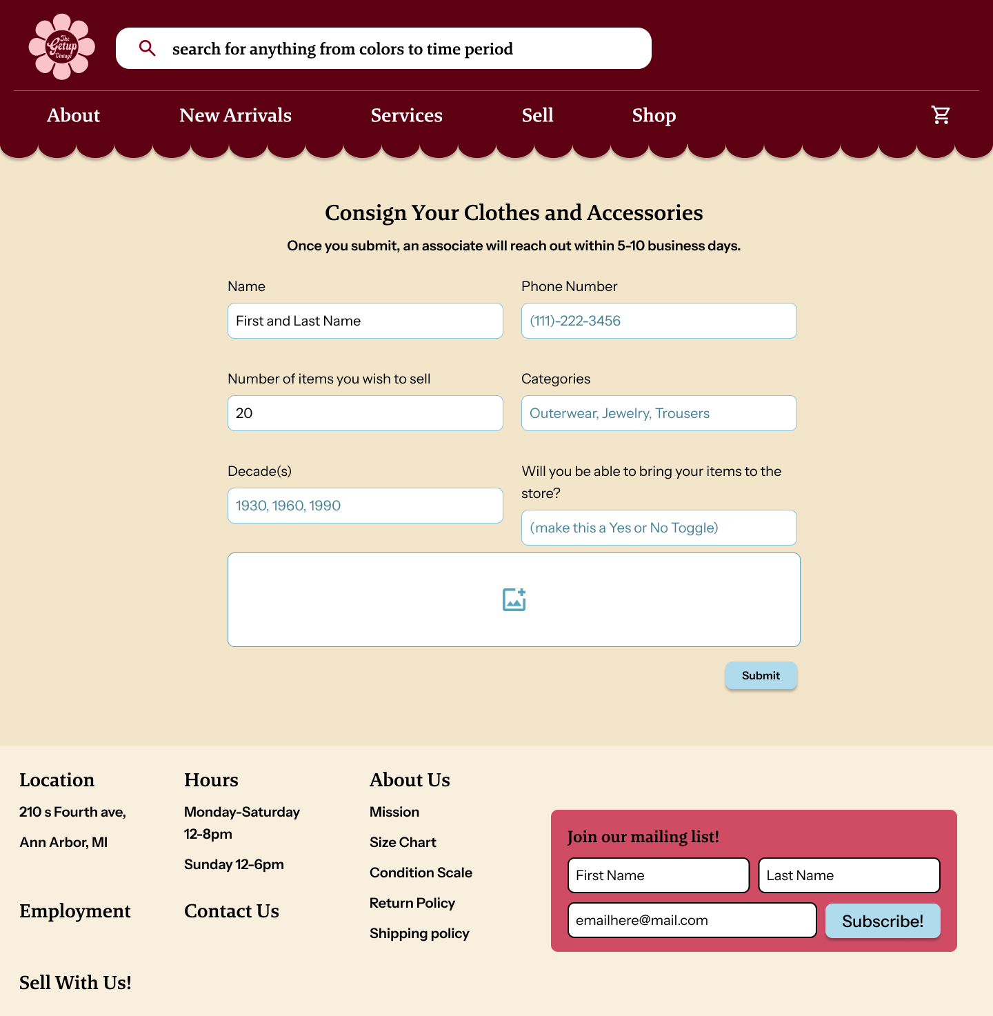
-Many customers had interest in selling their vintage finds but there was no clear indication that this was on option both online and in the store
Behind the Counter
-A quiet moment in the store gave me time to chat with one of the clerks. A few key takeaways:
-The store takes a 50% commission on gown sales.
-Men’s clothing is limited, mostly because inventory depends on what the owners can source.
- This mix of operational constraints and customer perception pointed to a clear challenge: the store has a strong personality and loyal following, but the value story isn’t being communicated clearly.
Key Insights
Perceived vs. Actual Value:
Customers don’t always understand why certain pieces cost more. The craftsmanship, sourcing, and repair work need better storytelling.
Customers don’t always understand why certain pieces cost more. The craftsmanship, sourcing, and repair work need better storytelling.
Decor Confusion:
The unique visual identity sometimes makes it unclear what’s actually for sale.
The unique visual identity sometimes makes it unclear what’s actually for sale.
Consignment Awareness:
Customers showed interest in selling their vintage items but there was a lack of awareness on how and where to consign items
Men’s Selection Gap:
Male customers feel underserved — an opportunity for inclusivity or clearer expectation-setting.
Male customers feel underserved — an opportunity for inclusivity or clearer expectation-setting.
Digital Bottleneck:
The website redesign was a step forward, but maintaining the online catalog is resource-heavy.
The website redesign was a step forward, but maintaining the online catalog is resource-heavy.
Looking at the original website:
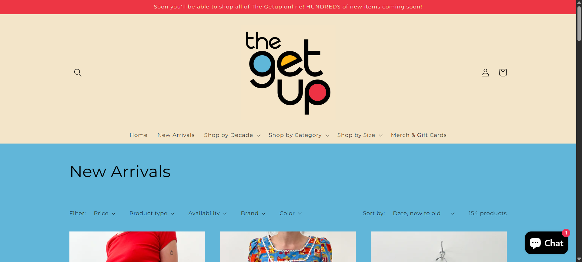
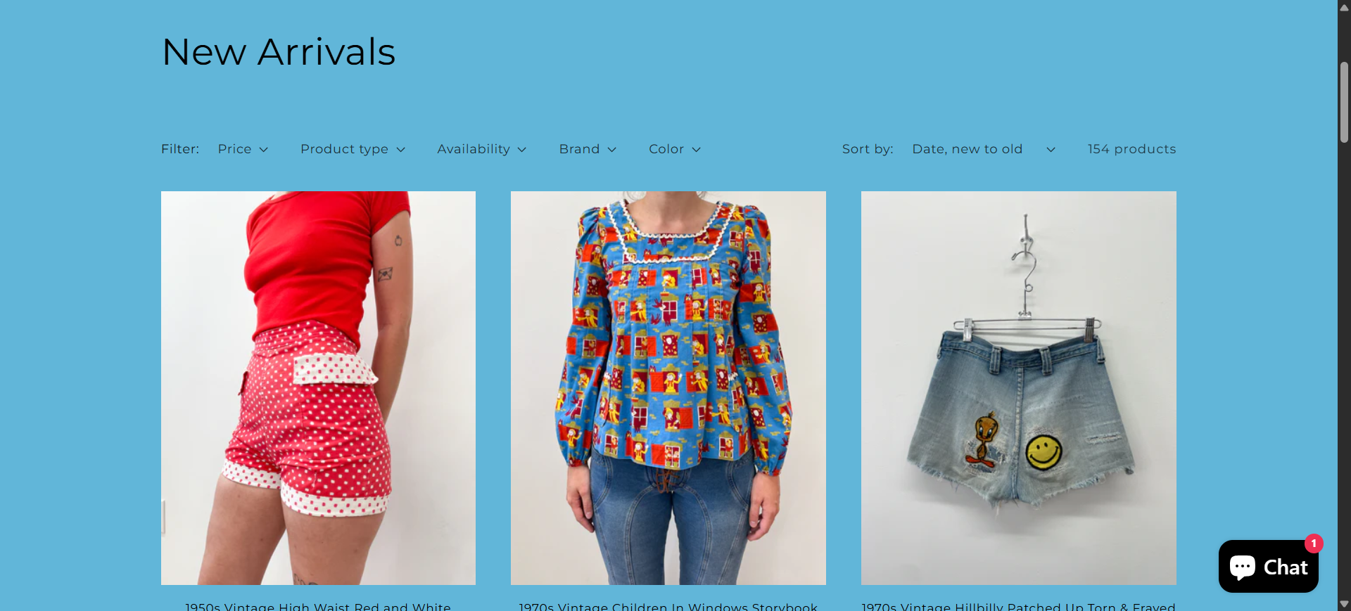
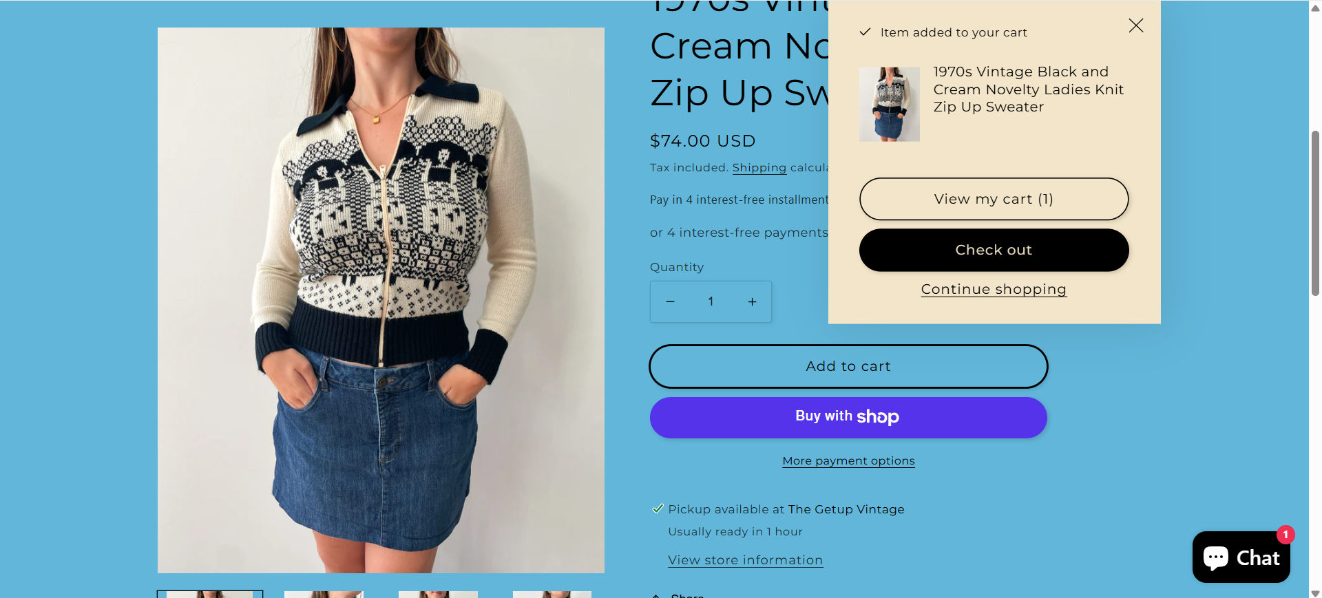
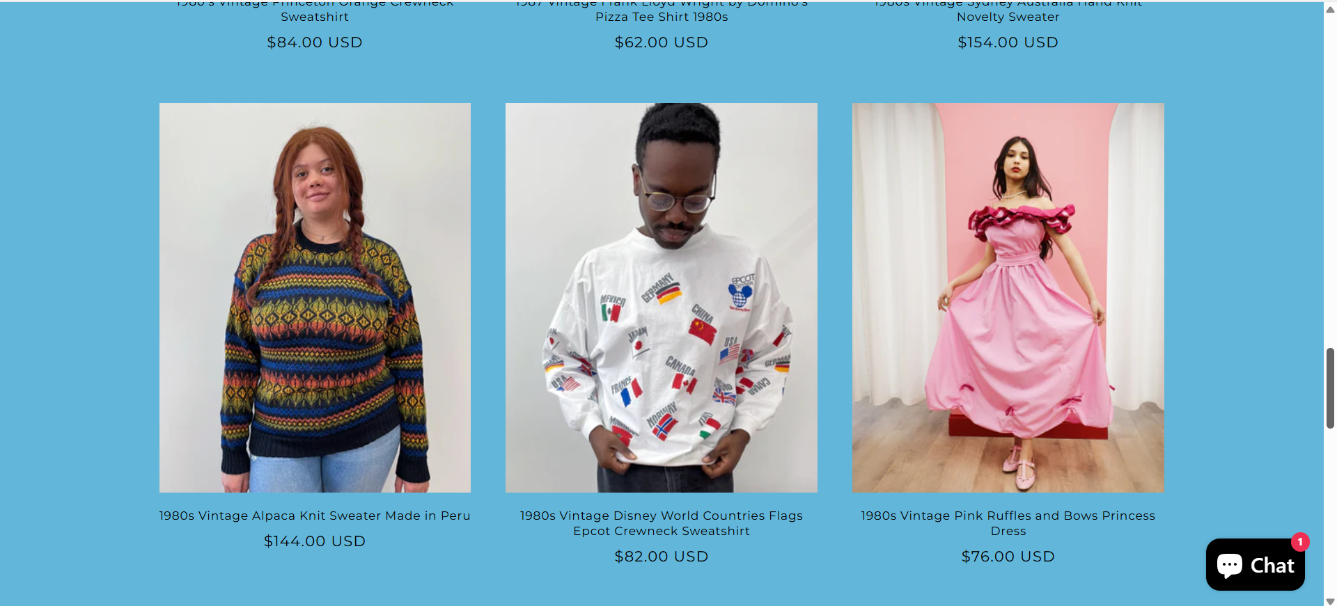
When analyzing The Get Up’s online presence, I found that many of the challenges observed in-store—particularly around clarity, storytelling, and user guidance—were mirrored in the digital experience.
The existing website, while functional and interactive, drops users directly into the New Arrivals section. This approach caters to returning customers but leaves new visitors without context. The brand’s story, curation process, and value proposition are absent, making it difficult to understand what sets The Get Up apart or why certain pieces command higher prices.
This gap was especially notable given my earlier research findings:
- Many customers question pricing and product value in-store.
- The brand’s expertise and curation—its strongest differentiators—aren’t communicated online.
- The audience is diverse, requiring multiple, tailored entry points into the experience.
From a UX standpoint, the lack of a true landing page caused the digital journey to start abruptly, missing a key opportunity to build emotional connection, articulate value, and guide users through discovery.
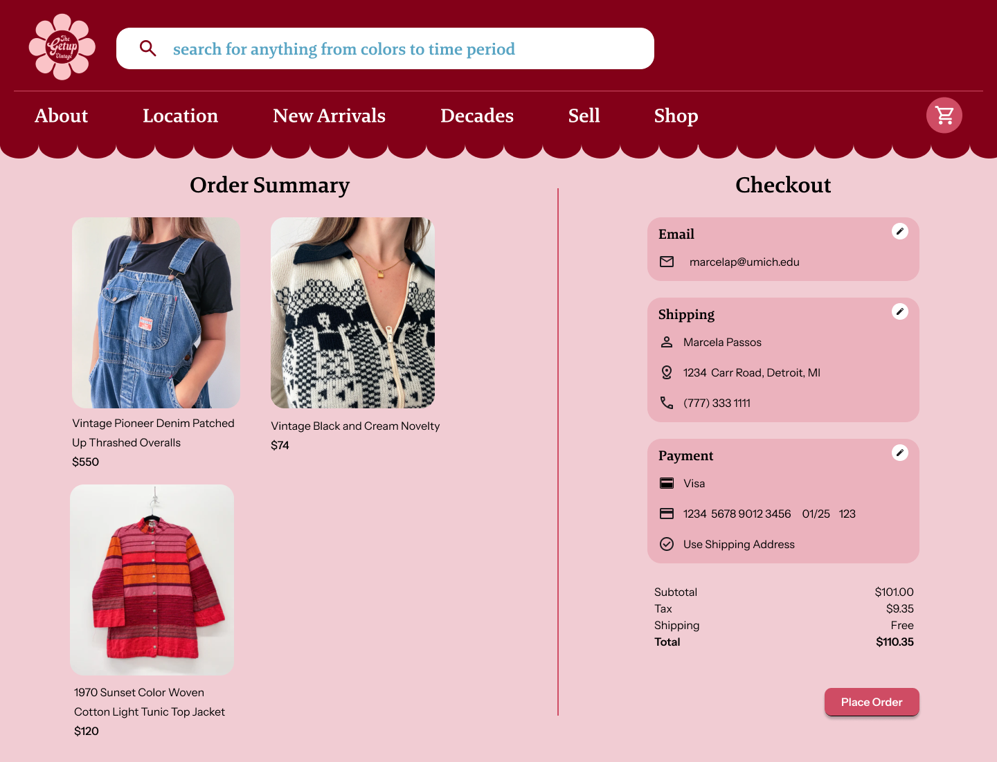
Problem Statement
The Get Up’s current website fails to communicate the brand’s story, values, and pricing rationale to new visitors. By directing users immediately to a product grid, the site overlooks an essential onboarding step; building trust and emotional connection through storytelling.
How might I create a dedicated landing page that:
-Introduces The Get Up’s brand identity and unique value proposition
-Educates users on the quality, care, and history behind curated vintage items
-Clearly guides different user types toward relevant content
-Gives visitors a high-end shopping experience that feels elevated and personal
-Reinforces the same personality and warmth found in the physical store experience
Designing and Prototyping
User Testing and Tweaking
Reflections